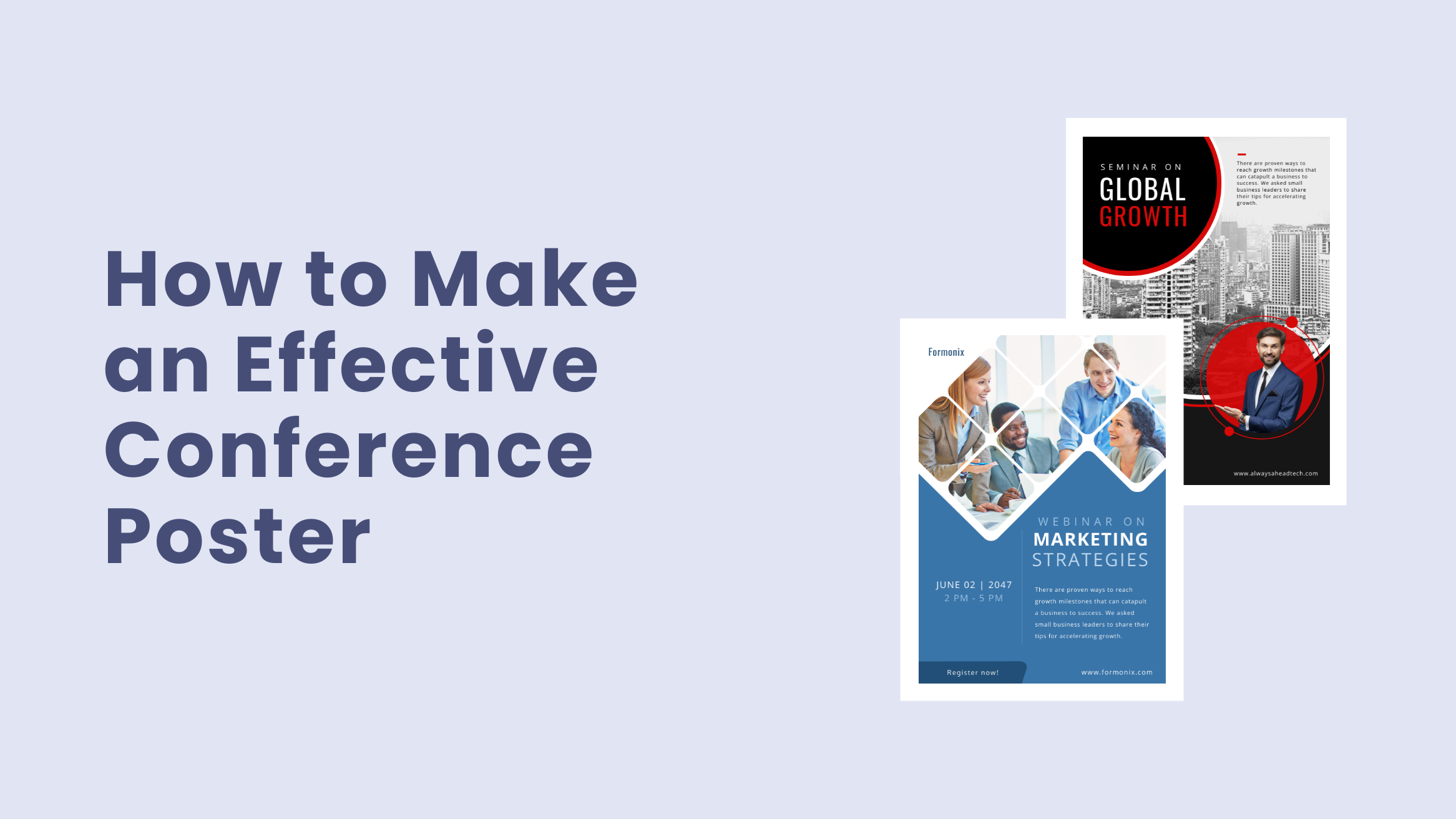
How to Make an Effective Conference Poster

Do you have an upcoming conference?
If yes, you must want many attendees to listen to you and interact at your conference.
Marketing your conference is as essential as organizing and hosting it; both need a lot of planning and hard work. A poster is one of the most impactful and cost-effective marketing tools to spread the word about your conference in a short period. A thoughtfully designed Conference Poster has a solid potential to drive awareness about your conference and bring in attendees.
Your Conference Poster design should intrigue the viewers to pause and take a moment to look at the details. However, if it is designed poorly, people will not mind walking past your poster, and you may lose out on attendees.
In this blog post, we’ll walk you through a seven-step simple guide on how to make an effective Conference Poster that encourages sign-ups in your conference and results in meaningful interaction with them. I’ll also showcase examples from our DocHipo template library for your inspiration and for you to get started with them right away.
Table of Contents
1. Determine Your Conference Poster’s Goal and Target Audience
If you have clarity on the goals that you desire to achieve through your Conference Poster, it’ll guide your design choices. Knowing and understanding your target audience well will help you craft the copy for your poster that will appeal to them and make them interested in attending your conference.
2. Get Inspired by Our Conference Poster Templates
Designing any poster from the beginning can be overwhelming and tedious. DocHipo simplifies this design process by providing you with stunning Conference Poster Templates and thus saving a lot of your time and energy.
Watch our video below on finding templates by format, industry, and occasion and land in the DocHipo editor.
Alternatively, you can sign up to DocHipo for free and land on the ‘All Templates’ page. Type in ‘Poster’ in the search bar and click on the result.
After that, choose Conference Poster Templates.
For example, here are some Conference Poster Templates.

Get This Template and More

Get This Template and More

Get This Template and More
As our design experts have done the heavy lifting, you can see the perfect balance of images, text, and other graphic elements in the templates. You can fully customize your chosen template as required with just the basic design sense and make them your own.
Now that your Conference Poster design is taken care of, you can focus on preparing for your conference.
3. Add Attractive Imagery
Make your Conference Poster stand out by adding readily noticeable and appealing visuals. Depending on your conference topic, the visuals could be images, illustrations, etc. Also, opt for simple imagery rather than an overly-detailed or busy one. It should grab your target audience’s attention at a glance and make them curious to know more about your conference.
One of the best choices is to use the speaker’s portrait as it’ll create the much-needed face connection. For example, the picture of the speaker himself is there in the below Conference Poster Template.

Get This Template and More
Check out How to Remove Picture Background in Just One in case you need it, just like the above design.
Watch our demonstration on how to upload images in DocHipo.
You can also head to DocHipo’s ‘Pictures’ widget under the ‘Graphics and Media’ tab for premium-quality stock images.
No matter your industry, you’ll find the right imagery that fits your design needs.
Drag your chosen picture and drop it on the existing one; it will get adjusted automatically.
You can flip the picture horizontally or vertically as needed.
It’s pretty obvious to use relevant imagery in your poster that conveys the context of your conference. Ask yourself whether the imagery is in sync with the copy of your poster.
Have a look at the Conference Poster Template below. The conference is about business strategies; a depiction of a team of employees discussing a meeting communicates the business aspect.

Get This Template and More
4. Customize Color Scheme
Try to limit your color usage to two-three colors. Using more than that can make the Conference Poster design look chaotic and unprofessional. Go for contrast and maintain a balance in the design by using light-colored background with a dark-colored text and vice versa.
For example, yellow and orange are a brilliant color combination, adding a pop-up color to the sleek and sophisticated Conference Poster design.

Get This Template and More
You can also opt for a monochromatic color scheme like in the two DocHipo Conference Poster Templates below.

Get This Template and More

Get This Template and More
To change the color of your poster design, select it and click on the color icon in the editing panel.
Put the color hex code in the bar provided or click on the color icon beside it to choose from the theme colors.
You can also experiment with the custom colors by clicking on the little color palette icon.
5. Customize Your Conference Poster Copy
Pique the interest of your target audience with your copy such that they get enticed to sign up and show up for the conference.
Keep the following points in mind while crafting your Conference Poster copy:
Offer Relevant Details
Your Conference Poster aims to draw your target audience into your conference. Noticeboards, coffee shops, social media channels, online discussion groups – no matter where you promote your poster, it needs to communicate as much information as possible at a glance.
So, what should a Conference Poster include?
- The conference title, its speakers, and special guests (if any)
- Give your target audience a strong reason why they should attend your conference
- The date and time of the conference
- The venue of the conference.
- A compelling CTA (Call To Action) mentioning the sign-up procedure
Watch our YouTube Video below on how to add a clickable link (for sign-ups) in DocHipo.
Look at the Conference Poster design emphasizing the key information attendees need to know with a polished and professional look.

Get This Template and More
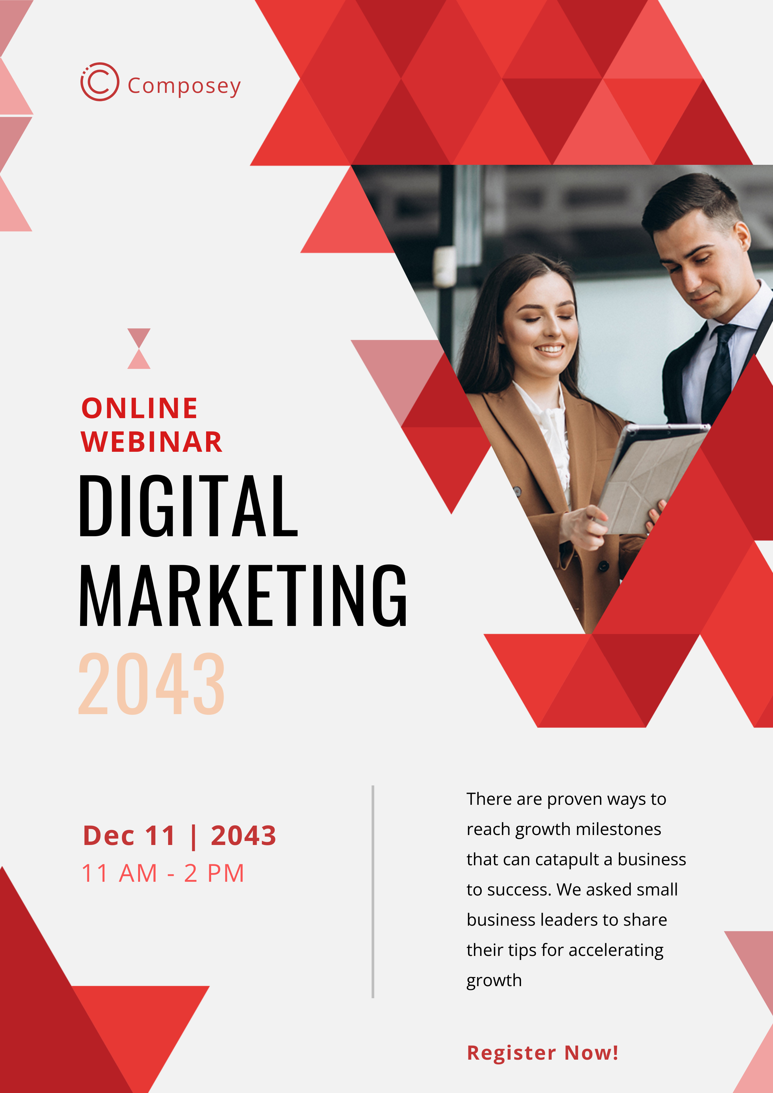
Similarly, in the DocHipo Conference Poster Template below, you can see a stunning image and a beautiful color overlay in its one-half. The conference title is in bold, eye-catching fonts, and the text color contrasts with the overlay.
The layout is brilliantly planned, as the strong reason (brief description) to attend the webinar is neatly presented with a lot of whitespace around it. Also, the orange box highlights the date and time of the online conference.

Get This Template and More
Focus on the Readability
Now, nothing can be worse than attracting viewers to your poster only to repel them because of poor readability. So, to attract their attention and make them want to read all the details, make your text easy on the eye for readers.
To increase the readability of your text:
- Craft a short yet descriptive title that’s clearly visible from at least 3 meters
- Display the conference title and crucial information in larger font sizes and the remaining details in smaller sizes
- Present your conference’s key discussion points by breaking them up into short sentences and, eventually, a more concise paragraph
- Choose legible fonts in sans serif for titles and serif font for the body text
- Avoid complex words: except for academic conferences, where you may need to use academic jargon, write in simple and easily understandable language
- Use a bulleted or numbered list instead of paragraphs, wherever possible
- Insert graphics and tables if applicable
Typography
Communicate the key discussion points with appropriate typography and design so that you can easily grab even an absent-minded passer-by’s attention.

Get This Template and More
Visual Hierarchy
Establish a visual hierarchy with an appropriate choice of color, size, and font styles.
For example, look at the below DocHipo Conference Poster Template.

Get This Template and More
Further Reading:
To edit an existing text in DocHipo, double-click on it and replace it with your own text. After you’ve added your text, you’ll get multiple text editing options from the above editing panel.
Refer to the below video while adding, editing, and deleting text in DocHipo.
6. Incorporate Your Branding and Other Design Elements
Don’t forget to incorporate your branding, no matter which marketing collateral you craft for your business. Now, your branding isn’t limited just to your business logo. It’s about your brand’s color scheme, fonts, overall design styles, and how you present your business to your target audience.
It’s highly essential to create your brand connection so that your new audience can be aware of your brand and the elements specific to your brand. Also, it helps your existing audience instantly recognize your brand, thus improving brand recognition.
Apart from the essentials, the other design elements may include shapes, patterns, lines, etc.
For example, observe the color scheme, placement of logo, the image style, etc., in the DocHipo Conference Poster Template below.

Get This Template and More
Next, we have this Conference Poster Template below. Look at the beautiful combination of purple, yellow and orange colors, the design patterns, logo placement, prominent visual, title in bold fonts, etc.

Get This Template and More
Next, the incomplete hexagonal shapes in the Conference Poster Template below make it stand out from the crowd.

Get This Template and More
Now that we’re at the end of our Conference Poster design process read The Ultimate Guide to Using the DocHipo Editor to customize it as you please.
Also, I highly recommend you watch our video tutorial on creating an engaging Conference Poster.
7. Download and Share
Once content with your poster design, click on three horizontal dots in the top-right bar to preview it. Then you can download it in multiple formats like PNG, PDF, etc., as needed.
Watch our demonstration video to download a document in JPG format.
Wrapping Up
Now that you know the steps for making an effective Conference Poster design, sign up to DocHipo for free, go through all the templates and pick the most suitable for your conference. DocHipo’s Design Widgets will equip you with the power to design it just the way you need. You’ll be all set with a stunning and professional Conference Poster and ready to draw a crowd relevant to your cause in no time.
FAQ
What is a conference poster?
A conference poster is one of the most impactful and cost-effective marketing tools to spread awareness about your conference and intrigue the target viewers to join it. A thoughtfully designed conference poster with the right information encourages more audience participation.
How do you organize a conference poster?
First, determine your conference poster’s goal and gather design ideas. Leverage the understanding of your target audience to craft a poster copy that encourages them to join. Add a professional picture of the speaker to help your audience create a connection with them. Choose a color scheme that reflects your brand and sets the tone for your conference. Incorporate your brand elements, such as your logo, fonts, etc, into the design.
What do you put in a conference poster?
In a conference poster, add the conference title, topics to be discussed, its speakers, special guests (if any), date, time, and medium, compelling CTA to mention the sign-up procedure, etc. Use a high-quality picture to grab viewers’ attention instantly and pique their interest.


